
Color isn’t just decorative—it’s persuasive. In food and beverage packaging, color influences how consumers feel, what they crave, and whether or not they buy. It shapes expectations about flavor, quality, and healthfulness—often within milliseconds. That’s the power of color psychology.
For brands, this means that food packaging color isn’t a design decision—it’s a strategic one. And for companies working with a custom label manufacturer, it’s also an opportunity. With the ability to produce labels in virtually any color and finish, you can apply these psychological principles to create packaging that connects and converts.
How Color Affects Consumer Behavior
Studies show that color increases brand recognition by up to 80% and can influence product perception, trust, and even taste expectations.
For example:
- A green smoothie bottle might communicate freshness and health.
- A red snack label might create a sense of urgency or appetite.
- A purple chocolate wrapper signals indulgence and luxury.
Color works fast. In crowded shelves or digital product listings, it often determines which product a shopper notices first.
Common Color Meanings in Food and Beverage Packaging
Here’s how different colors are often interpreted in the food world:
- Red – Stimulates appetite, creates urgency, and boosts energy. Great for spicy foods, snacks, or bold flavors.
- Orange – Friendly, inviting, and often associated with affordability. Seen in drinks, breakfast foods, and seasonal products.
- Yellow – Cheerful and attention-grabbing. Often used in cereals, dairy, and kids’ products.
- Green – Natural, organic, healthy. Perfect for plant-based, sustainable, or clean-label products.
- Blue – Clean, pure, refreshing. Works well for water, dairy, and “light” products. Not commonly associated with strong flavors.
- Purple – Premium, indulgent, or artistic. Used for wine, dark chocolate, and specialty foods.
- Brown – Rustic, wholesome, and grounded. Common in coffee, baked goods, or whole grain products.
- Black – Sleek, modern, and upscale. Often used for luxury beverages or minimalist branding.
- White – Simplicity, purity, and clarity. Used in wellness products and “free-from” foods (gluten-free, sugar-free, etc.).
These aren’t rules—but they are trends, and brands can use or subvert them intentionally.
Real-World Examples of Color Strategy
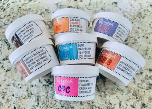
- Ice cream brands often use pastel colors (light blue, mint green, soft pink) to emphasize sweetness and playfulness.
- Energy drinks favor bold reds, blacks, and metallics to convey strength and intensity.
- Organic snacks rely on earth tones and matte finishes to highlight their natural appeal.
- Water brands almost always lean on blue or white for that clean, crisp impression.
The common thread? The color tells part of the product story—before a consumer even reads the label.
Why Customization Matters
If you’re limited to standard print runs or restricted color palettes, your label design can’t fully capitalize on these psychological triggers. That’s where Red Oak Label’s custom label printing makes a difference.
We specialize in:
- Custom full-color food and beverage labels
- Short-run printing for seasonal or limited-edition products
- Specialty finishes and color-matching for premium branding
- Roll-form labels for automated production
- Freezer-grade, moisture-resistant, and direct thermal labels
Whether you’re creating bright, eye-catching snack labels, earthy frozen produce packaging, or bold beverage labels, we can print the precise colors that match your vision—and your strategy.
Check out our Art Guidelines for help preparing your label files to make the most of your design.
Final Thoughts: Packaging That Connects at a Glance
Color psychology in food and beverage packaging is more than a trend—it’s a competitive advantage. When used intentionally, food packaging color can boost shelf impact, guide consumer expectations, and build trust with your audience.
With the freedom to create nearly any color combination and the expertise to guide your decisions, Red Oak Label helps you turn those insights into real-world results. If you’re ready to design labels that connect with your consumer, contact us or request a quote today.