
 Welcome to the realm of label design! Our prepress department here at Red Oak Label has seen the creativity and innovation that individuals bring to their projects, especially when using accessible tools like Canva. Crafting your label art is an exciting journey, but there are some crucial factors to consider when preparing designs for print production. Let’s delve into some of the downfalls and key considerations for a seamless transition from digital art to printed labels.
Resolution Matters:
Canva is fantastic for digital creations, but when it comes to print, resolution is key. Often, images designed for web display lack the necessary resolution for high-quality printing. For labels, aim for a minimum of 300 dpi (dots per inch) to ensure your design translates crisply onto physical labels without appearing pixelated or blurry.
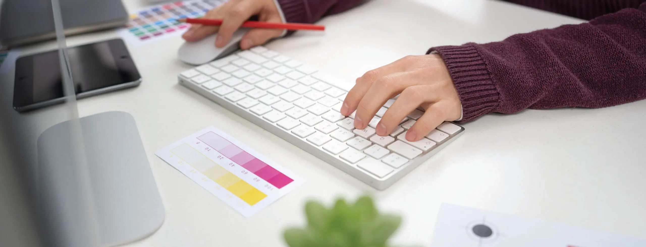
Color Consistency:
The vibrant hues on your screen might not appear the same in print due to variations in color profiles between digital and print media. Consider using CMYK color mode in Canva, which aligns with the printing process, ensuring more accurate color representation. Additionally, be mindful of color calibration across different devices as it can impact how your labels look in print.
File Format Selection:
While Canva allows for easy design creation, exporting your final design in the correct file format is crucial for print production. PDF our preferred format for printing labels as it maintains design integrity, preserves layers, and ensures compatibility across various printing software.
Bleed and Safe Zones:
Labels aren’t just about the central design; they also involve the edges. Incorporating bleed—an extension of artwork beyond the label’s edge—ensures that there are no white borders after cutting. Similarly, keeping critical elements within a safe zone prevents important details from being trimmed during the label cutting process.
Typography and Font Selection:
Canva offers an array of fonts, but not all are print-friendly. Some fonts might look fantastic on screen but might not translate well when printed, especially in smaller sizes. Choose fonts that are legible and consider the readability factor, especially for product information.
Consulting Professionals:
While DIY designs are empowering, consulting with prepress professionals can offer valuable insights. They can guide you on technical aspects, provide tips for optimization, and ensure your designs are print-ready, saving time and resources. At Red Oak Label, we have a fully staffed art and prepress department ready to help! Contact us with any questions!
While designing labels on Canva is an excellent starting point, offering accessibility and creativity, understanding the nuances of print production is crucial to ensure that your label designs transition seamlessly from digital screens to tangible products. By considering resolution, color, file formats, bleed, typography, and seeking expert advice, you pave the way for remarkable printed labels that captivate your audience. See our Art Guidelines for even more information on best practices for your files.
Remember, the journey from concept to a physical label is a collaboration between creativity and technical precision. Embrace both aspects, and you’ll witness your designs transform into captivating, high-quality labels that speak volumes about your brand.